Monday, 14 May 2012
Thursday, 29 March 2012
Wednesday, 28 March 2012
evaluation question 4
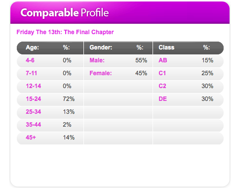
following secondary research in the initial stages of my project i found the audience for Friday the 13th were mostly male aged 15-24 and in the class category of C2 and DE. i then conducted primary research which suggested i should aim my film at the same target audience that Friday the 13th was aimed at. therefore the audience for my product will be male aged 15-24 and in the class category of C2 and DE.


Tuesday, 27 March 2012
Monday, 26 March 2012
Monday, 5 March 2012
rough cut


Tuesday, 28 February 2012


Monday, 27 February 2012


Wednesday, 22 February 2012
Creating logos - part one


Monday, 20 February 2012
Production Update
6 weeks until Easter
4 weeks remaining on product construction
Monday 5th of March - rough cut of final product
Monday 19th of March - deadline of final product
Friday 30th of March - 7 evaluation questions
Monday 16th of April - completed portfolio hand in
Within the next 2 weeks - logo's, soundtracks and shooting needs to be finished
Wednesday, 1 February 2012
Image Analysis


The first image is a close up shot showing the whole of the face and showing the detail of the face the face is made out to be quite scary, her face is white but her teeth and mouth are black making you notice the horrible look that she has, her eye line is in the center of the main power points.
The second image is a medium shot of a women who looks to be quite scared it is edited so that she has blood all over her clothes the room is dark with only the light on her so that you know she is is the main piece of the shot her eye line is slightly above the upper power points. the shock on her face shows you that something has happened and that she is scared also the way she is sweating.
Tuesday, 31 January 2012
Peer assesment of storyboards
My story board has been assessed by two individuals, they came to the conclusion that the two good points of my story board was that it is relevant to the genre of film i am making and that there are a good range of different shots to help show the genre.
however they decided that there are two improvements that need to be made to my story board which is i need to change the font style and color to match the genre of film i am creating so a scarier style of font and a darker scarier color such as a dark red color, the also insisted that i need to create a relevant sound for my film so maybe a deep or hollow type of sound perhaps switching to a slightly higher pitch when there is more action.
however they decided that there are two improvements that need to be made to my story board which is i need to change the font style and color to match the genre of film i am creating so a scarier style of font and a darker scarier color such as a dark red color, the also insisted that i need to create a relevant sound for my film so maybe a deep or hollow type of sound perhaps switching to a slightly higher pitch when there is more action.
Sunday, 29 January 2012
Wednesday, 25 January 2012
Primary audience research
I conducted primary audience research in order to :
- to find out what appeals to my target audience
- to discover any flaws or potential improvements
- to identify my gaps in the market and place a refreshing new twist on the genre
Monday, 23 January 2012
Audience research for film
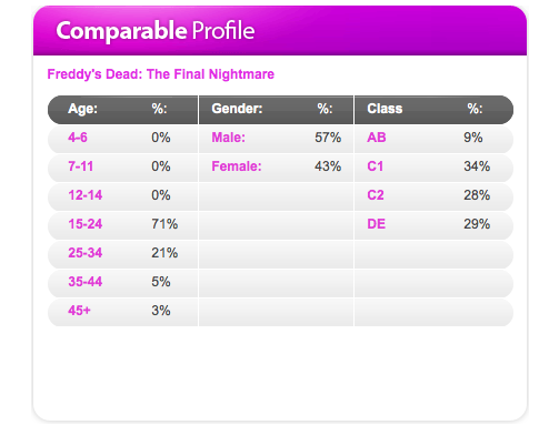
This is the audience profile for A nightmare on Elm street it shows me that the main percentage of gender is male, the percentage of age is 15-24 and the main percentage of class is C1
Thursday, 22 September 2011
Inspirational Covers and Contents Pages

This magazine uses a medium close up for the main image. The image is framed by an array of sell lines. It uses 3 mains colours of blue, white and black. The masthead is white and blue and larger than all other text to attract the readers attention. Moreover, it's positioned to the top left of the page which is where the readers eyeline falls first.

A medium close up has been used and it's positioned centrally on the magazine. Like GQ a 3 colour pallete has been used (blue, white and black). the masthead is larger than all other text on the page making it stand out to draw the readers in and catch there eye.


this contents page also has one main photo, there are 3 main colours of red, white and black the main headline 'contents' t in bold and white. the side bar is fairly simple with not to much colour


Wednesday, 14 September 2011
Tuesday, 13 September 2011
Subscribe to:
Comments (Atom)